
Hover Gallery
Meet the Divi Sensei Hover Gallery module for Divi! Build an interactive gallery of expanding panels — visitors hover (or click) an item and it grows to reveal its title, description and button while the other panels gracefully shrink aside. A show-stopping way to present services, projects or team members.
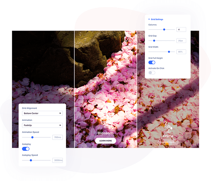
With the Hover Gallery module you can:
- Add any number of gallery items, each with its own background image, icon or thumbnail, title, body text and button
- Expand items on hover or on click
- Reveal the item content with one of 8 animations — fades, zooms and a slice effect
- Let Autoplay cycle through the items automatically, with a progress bar indicator
- Style the default and active state of every element separately — item, image, text and button
- Control the grid precisely — columns, gap, width, height and alignment
How the module works
The Hover Gallery is a parent/child module. The parent module controls the grid, the activation behavior and the shared styling; each child item is one expanding panel. Every element has two looks: the default state (collapsed panel) and the active state (expanded panel) — styled in matching group pairs like Item Style and Item Style Active.
How to add the Hover Gallery module
- Open a page with the Divi Visual Builder
- Click the + (Add New Module) button
- Search for Hover Gallery and click it to insert the module
- Add a child item for every gallery panel and fill in its content
Grid Settings
The parent module’s Grid Settings group controls the layout and behavior:
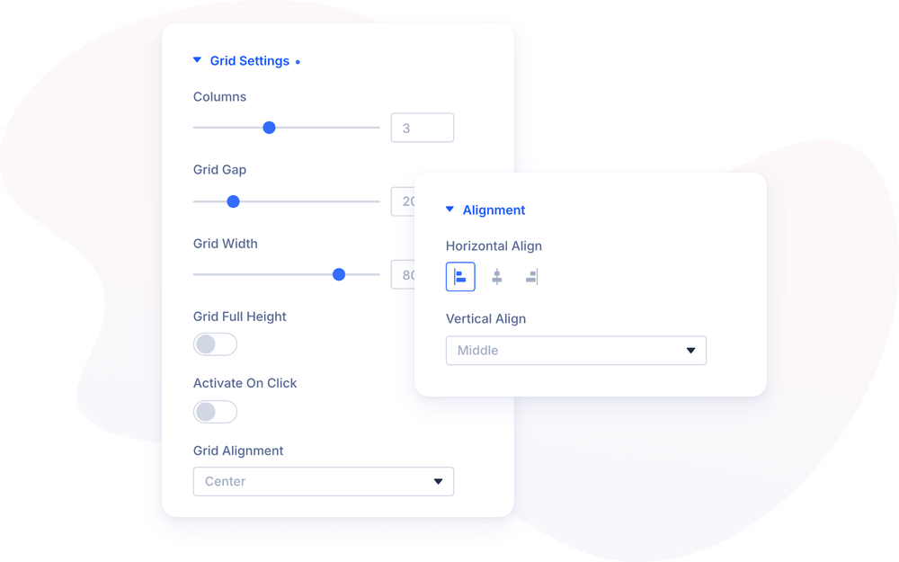
- Columns — how many panels the gallery shows (1–6, default 3)
- Grid Gap — the space between panels (default 20px)
- Grid Width / Grid Full Height — the gallery’s size within the page
- Grid Alignment — position the grid within the module
- Activate on click — expand items on click instead of hover; handy for touch-heavy audiences
- Animation — how the item content appears when a panel expands: FadeIn, FadeUp, FadeDown, FadeRight, FadeLeft, ZoomIn, ZoomInZoomOut or the SliceAnim effect, with an adjustable Animation Speed (0–2000ms)
Autoplay & Progress Bar
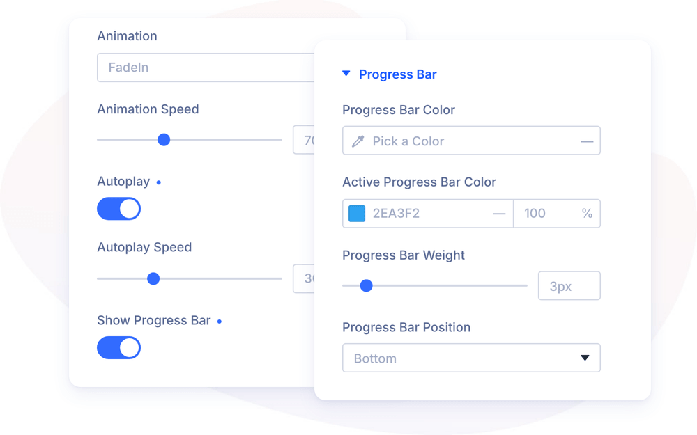
The gallery can present itself: with Autoplay enabled, the module expands the items one after another in a loop — great for hero sections and showcases that should keep moving on their own.
- Autoplay — enable the automatic item rotation
- Autoplay Speed — how long each item stays expanded before the next one opens (100–10000ms)
- Show Progress Bar — display a progress bar that fills up before the next switch, so visitors can see when the gallery is about to move on
With Show Progress Bar enabled, a dedicated Progress Bar group appears in the Design tab:
- Progress Bar Color — the color of the bar track on inactive items
- Active Progress Bar Color — the fill color on the active item
- Progress Bar Weight — the bar thickness
- Progress Bar Position — attach the bar to the top, bottom, left or right edge
Gallery Items
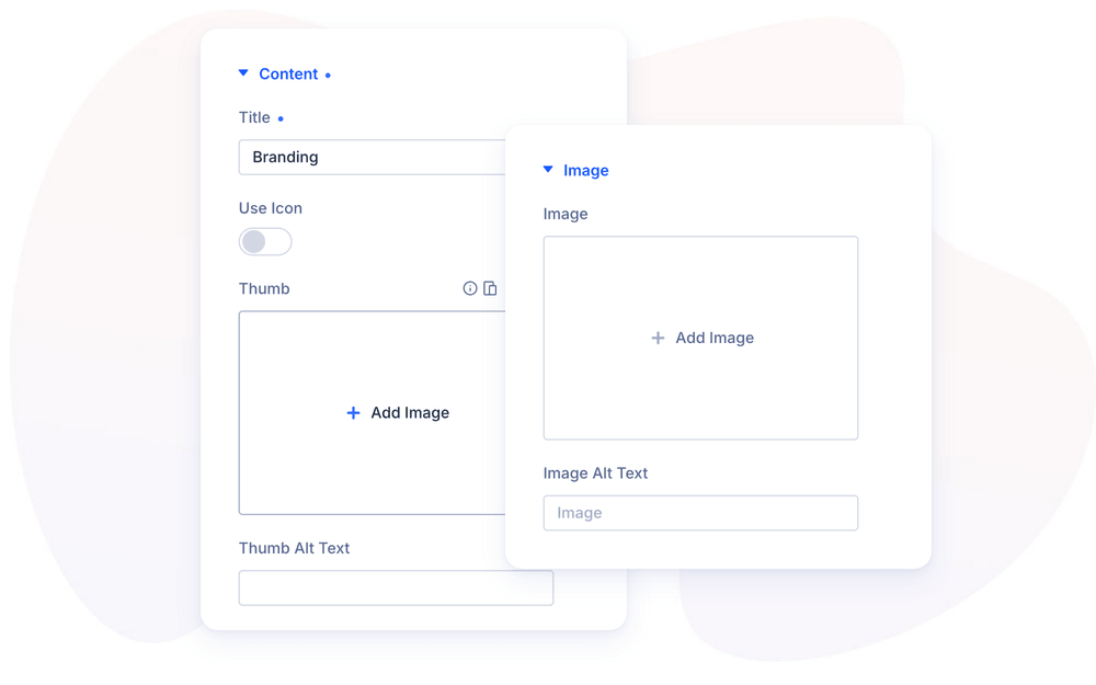
Each child item is one panel, configured in its own settings modal:
- Image — the panel’s background image with Image Alt Text
- Content — an optional icon (with Use icon) or thumbnail image, the Title, the Body Text shown when the panel expands, and an optional button (Use Button, with text, URL and link target)
- Alignment — the Horizontal and Vertical alignment of the content inside the panel
- Link — make the whole panel a link
Design Settings
Every content element has a default and an active styling group, so the collapsed and the expanded panel can look completely different:
- Item Style / Item Style Active — the panel itself: background, overlay, border and shadow in both states
- Content Text / Content Text Active — typography for title and body in both states
- Content Image & Icon / Content Image & Icon Active — icon or thumbnail styling in both states; enable Enable Active Icon/Image Style to unlock the active variant
- Button / Active Button — full button styling in both states
- Progress Bar — the autoplay indicator described above
Global vs. per-item styling
The parent module’s design groups style all items at once — the fastest way to a consistent gallery. Each child item repeats the same groups, so a single panel can override the global look — for example a different overlay color per project. A practical workflow: style the first item, then duplicate it for the remaining panels and only swap the content.
NOTE: If the gallery is not displayed correctly on the front-end, clear the Static CSS Files in Divi → Theme Options → Builder → Advanced — even if that option appears disabled.
Design Ideas
- Services showcase — 4 columns, icons + titles visible when collapsed, description and a “Learn more” button revealed on hover.
- Self-playing portfolio — Autoplay at 4000ms with the progress bar on the bottom edge; each panel links to a project page.
- Team gallery — portrait background images, Activate on click, bios and profile buttons in the expanded state.