
Advanced Tabs
Meet the Divi Sensei Advanced Tabs module for Divi! Organize any content into beautiful, animated tabs — with icons or images on the tab headers, manual or Divi Library content in the panels, and a built-in Autoplay mode with a progress bar indicator that cycles through your tabs on its own.
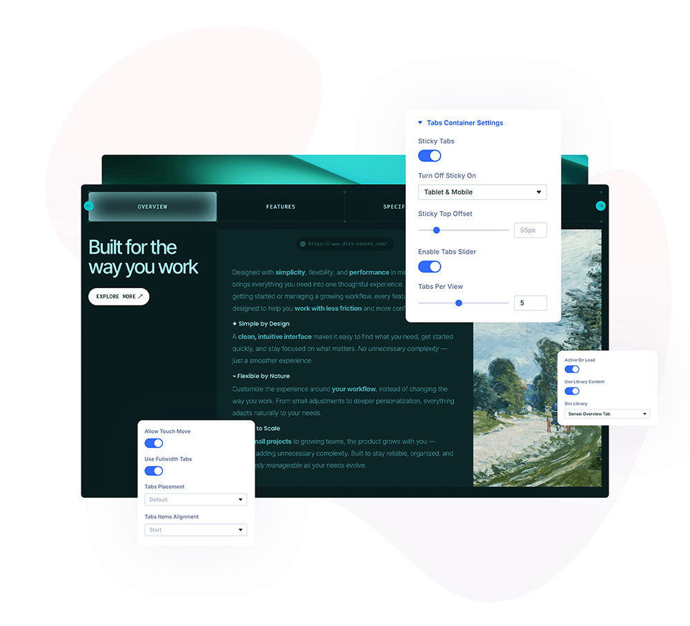
With the Advanced Tabs module you can:
- Add unlimited tabs, each with its own title, subtitle and icon or image
- Fill every tab with manual content (text, image, button) or a Divi Library layout
- Reveal tab content with one of 19 animations, with adjustable duration
- Switch tabs on click or hover, or let Autoplay cycle through them with a progress bar indicator
- Turn the tab bar into a slider with navigation arrows when tabs don’t fit one row
- Style every part separately — tabs, active tab, active arrow, content area, buttons and the progress bar
Installation
Divi Sensei Advanced Tabs is a standalone plugin:
- In WordPress, go to Plugins → Add New → Upload Plugin
- Upload the plugin ZIP file, click Install Now, then Activate
- The Advanced Tabs module appears in the Divi Builder’s module list
How to add the Advanced Tabs module
- Open a page with the Divi Visual Builder
- Click the + (Add New Module) button
- Search for Advanced Tabs and click it to insert the module
- Add a child item for every tab and fill in its content
Tab Items
Each child item is one tab. In its Content tab you can configure:
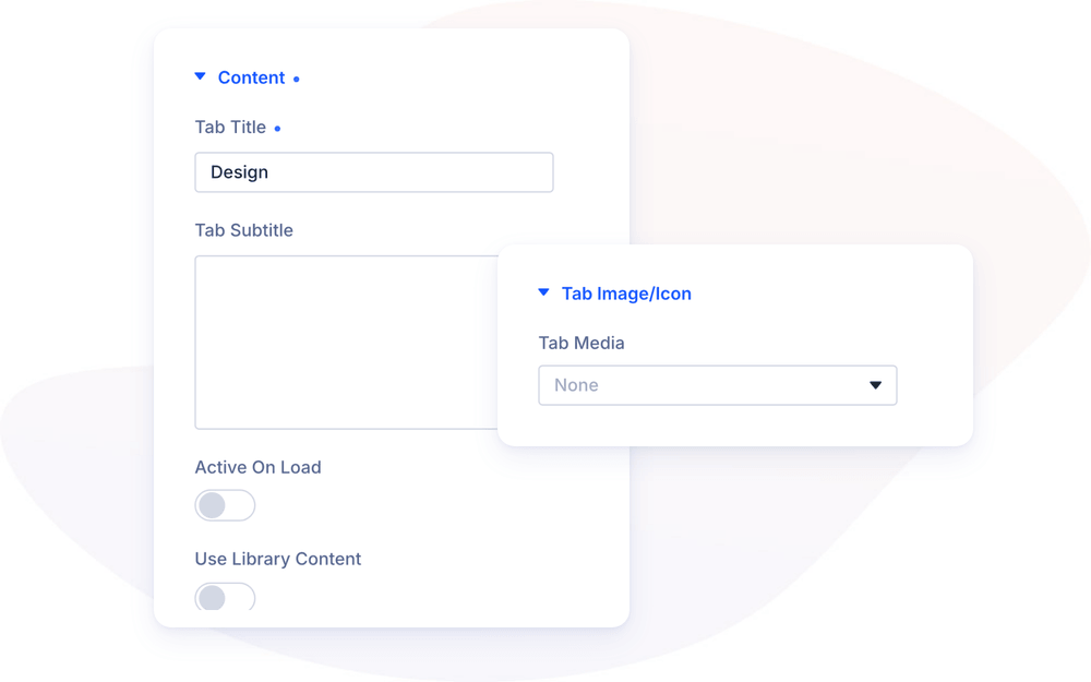
- Content — the Tab Title and subtitle shown on the tab header, and the panel content: either manual content (rich text, an image with positioning options, and a button) or, with Use Library Content enabled, any layout saved in your Divi Library
- Tab Image/Icon — an icon or image displayed on the tab header, with separate images for the normal and active state
- Tab Selector — an anchor ID for deep-linking, so a link can open this exact tab (from the same page or another page using the full URL)
- Active on Load — mark this tab as the one opened by default
Tabs Settings
The parent module’s Tabs Settings group controls the switching behavior:
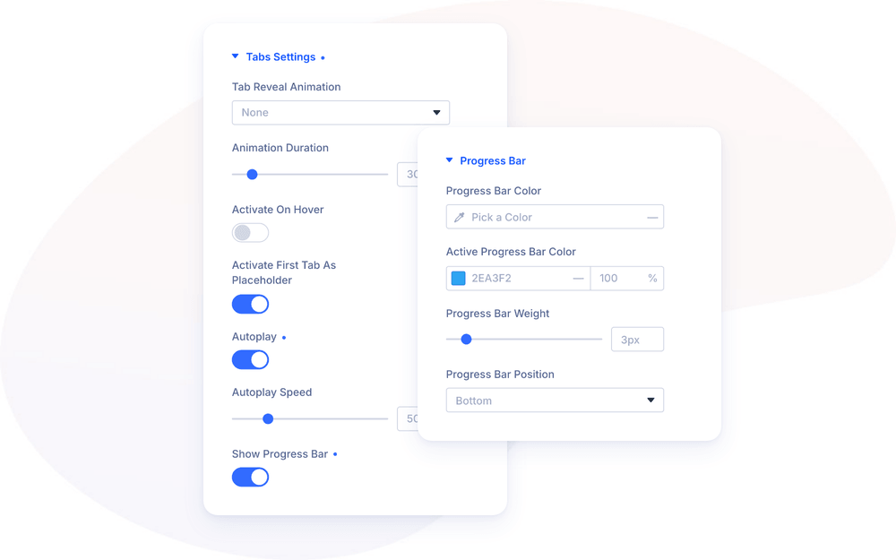
- Tab Reveal Animation — how the content appears when a tab activates: fades, zooms, bounces, flips, rotations and more (19 presets), with an Animation Duration of 0–3000ms
- Activate On Hover — switch tabs on hover instead of click
- Activate First Tab as Placeholder — automatically open the first tab when no tab item is set as active on load
Autoplay & Progress Bar
Advanced Tabs can present itself: with Autoplay enabled, the module automatically switches to the next tab in a loop — perfect for feature showcases and testimonial rotations that should keep moving without any interaction.
- Autoplay — enable the automatic tab switching
- Autoplay Speed — how long each tab stays visible before the next one opens (1000–20000ms, default 5000ms)
- Show Progress Bar — display a progress bar on the tabs that fills up before the next switch, so visitors can see when the tab is about to change
The autoplay is aware of your visitors:
- Hovering over the tabs pauses the cycle — and the progress bar with it — and resumes with the remaining time when the mouse leaves
- The cycle also pauses while the module is outside the viewport, so tabs never switch unseen
- A manual click or hover on a tab restarts a fresh full cycle from that tab
- When the tabs slider is enabled, autoplay automatically scrolls the active tab into view
With Show Progress Bar enabled, a dedicated Progress Bar group appears in the Design tab:
- Progress Bar Color — the color of the bar track on inactive tabs
- Active Progress Bar Color — the fill color on the active tab
- Progress Bar Weight — the bar thickness (1–20px, default 3px)
- Progress Bar Position — attach the bar to the top, bottom, left or right edge of the tabs
NOTE: The progress bar fill duration always matches the Autoplay Speed, and it restarts automatically whenever the active tab changes — including manual switches.
Tabs Slider
When you have many tabs, enable Enable Tabs Slider to turn the tab bar into a horizontal slider with navigation arrows instead of wrapping tabs into multiple rows. The arrows are styled in the Design tab’s Tabs Slider Nav group (arrow color, background, circle style), and Allow Touch Move controls swipe behavior on touch devices.
Design Settings
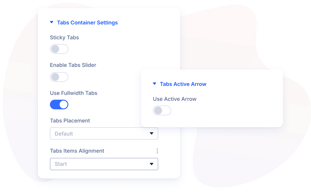
- Tabs Container Settings — position of the tab bar relative to the content (top, bottom, left, right), tab width, and sticky tabs that stay visible while the content scrolls
- Tabs Item / Tabs Item Text / Tabs Item Text Active — spacing, background, border and typography for tabs, with separate styling for the normal and active state
- Tabs Active Arrow — a decorative arrow on the active tab with color, size and alignment options
- Content Area Settings — spacing, vertical alignment, border and shadow of the content panel, plus Scroll to Content for mobile
- Progress Bar — the autoplay progress bar styling described above
- Heading Text / Body Text / Button Style — typography and button styling for the panel content
The module also supports the standard Divi groups — Sizing, Spacing, Border, Box Shadow, Filters, Transform and Animation.
Design Ideas
- Self-playing feature tour — Autoplay at 6000ms with the progress bar on the bottom edge in your accent color; visitors watch the features present themselves.
- Vertical service tabs — tabs positioned left with icons, sticky tabs enabled for long content panels.
- Testimonial rotator — one testimonial per tab, Activate On Hover off, Autoplay on, progress bar hidden for a cleaner look.