Blog Slider
Blog Slider module is a perfect way to showcase your blog posts in a sliding form. You can customize a number of columns that will be displayed for desktops, tablets and mobiles. The module offers many customization options. We can select what elements in the blog post box will be displayed and what not. We can add a nice hover animation for the blog post image, customize navigation, date ribbon, read more button, all texts and more!
Content Settings
In the Content tab, we can select how many posts will be displayed, select categories and control if the excerpt text should be displayed. If it’s enabled, we can also define how long the excerpt text should be.
Elements
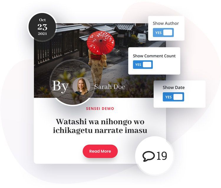
In the Elements tab, we can select what elements will be displayed for our blog posts slider. To enable/disable elements go to Content → Elements. We can Enable/Disable the following elements:
Featured Image
Define Featured Image Height
Read More Button
Author
Date
Categories
Comments
Excerpt
Slider Settings
In this tab, we can customize what our Blog Slider will look like. We can select columns for desktops, tablets and mobiles, define the spacing between blog post boxes, select effects, enable navigation and more. To access slider settings go to
Content → Slider Settings.
Here is a list of all available options:
Number of Columns
Spacing
Effect (Slide/Coverflow)
Transition Duration
Loop
Autoplay
Pause on Hover
Autoplay Speed
Navigation
Pagination
Centred
Design Settings
Image
In the Design tab, we will find 7 custom tabs with options that will help us customize the design of our Blog Slider module. The first tab is an Image. We can select image animation on hover and add an image overlay background for the default and hover states. To customize the blog post image go to Design → Image
Image Animations:
None
Zoom In
Zoom Out
Rotate
Blog Item
The blog Item tab allows us to customize the look of our single blog post box. We can add a background, border, and box shadow. To customize the blog post box go to Design → Blog Item.
Blog Texts
In Design → Blog Texts we have a tabbed area with text customization options for title, description, category and author.
Blog Date
The Pixel Blog Slider offers custom designs. We have separated the date from the meta text and placed it in the right corner. We can display a square or circle ribbon with the date. We can also change spacing, date fonts, and ribbon colors. To customize date ribbon go to Design → Blog Date
Navigation
If we enable Arrow Navigation for our Blog Slider, then we can customize its look in the Design/Navigation tab. We can select icons for the left and right arrows, tweak the positioning, define icon size, colors, make the arrows circle and tweak spacing. Blog slider navigation can be customized in Design → Navigation
Pagination
In the Pagination tab, we can select color for active and not active pagination bullets. We can also tweak the Pagination Navigation position. To access pagination settings go to Design → Pagination
Read More
In the Read More section, we can enable custom style for our Read More button where all default Divi button customization options are available. Additionally, like all other elements, we have added options for position, so the button can be aligned to the left, centre, or right. Read More button customization settings can be accessed in Design → Read More